Key Takeaways
- A strong headline with bold fonts and power words immediately captures attention and sets the tone for the brochure.
- Concise, engaging content that highlights key benefits keeps readers interested and improves readability.
- High-quality images and a clean layout enhance visual appeal and make information easy to digest.
- A clear call-to-action (CTA) encourages potential customers to take immediate steps, such as visiting a website or making a purchase.
- Properly displaying brochures with holders ensures they are seen, picked up, and effectively utilized in marketing efforts.
A marketing brochure is more than just a piece of paper; it’s a visual pitch that speaks for your business and addresses your target audience. It captures attention, conveys key messages, and leaves a lasting impression if done right.
But how do you ensure your brochure is both informative and engaging?
he key is in the design elements. From layout to content, and even the strategic use of countertop sign holders to enhance visibility, here are five crucial elements that make your marketing materials compelling.
1. An Eye-Catching Headline
The headline is the first thing potential customers notice. It should be clear, concise, and intriguing enough to draw readers in. Avoid long-winded phrases—stick to a short, impactful message that highlights your main selling point.
Use bold fonts and power words that evoke curiosity or urgency. Think about what sets your business apart and make it the focus of your headline. For example, instead of “Our Company Offers the Best Solutions,” try “Boost Your Business with Expert Solutions!” This is your chance to create an effective brochure that immediately captures interest.
2. Engaging and Concise Content
Your brochure should provide valuable insights without overwhelming the reader. Keep sentences short and to the point. Break up the content into sections with subheadings for easy readability and ample space between elements.
Focus on what your target audience needs to know. Highlight key benefits instead of listing generic features. For example, instead of saying, “Our services include consulting,” say, “Get expert consulting that helps your business grow faster.” Use bullet points to summarize information effectively, making it easy for readers to skim through.
3. High-Quality Images and Visual Elements
A brochure without visuals is like a story without pictures—it lacks engagement. High-resolution images improve visual appeal and make your content easier to digest. Choose photos that represent your brand’s message.
Use a balanced layout with ample white space. Cluttered designs can make brochures difficult to read. For example, if you’re designing real estate brochures, include high-quality images of properties rather than generic stock photos. Keep it sleek and professional to maintain an excellent choice of visuals and improve comprehension.
4. A Clear Call-to-Action (CTA)
Every marketing brochure should guide readers toward a specific action. Whether it’s visiting your website, making a purchase, or contacting your business, your CTA should be clear and compelling.
Use actionable language like “Call Now,” “Visit Us Today,” or “Get Your Free Quote.” Make sure the CTA stands out by using high-contrast color combos or bold fonts to draw attention. For example, “Sign up today and receive a 10% discount on your first order!” gives the reader a reason to act immediately.
5. Contact Information and Business Details
Your brochure is useless if customers don’t know how to reach you. Ensure your business name, phone number, website, and social media handles are easy to find.
Place your contact information in multiple locations, including the back of the brochure. If your business has a physical representation, adding a small map can also be helpful. For example, “Find us at 123 Main Street, just two blocks from Central Park,” makes it easier for potential customers to locate you.
What to Add on a Brochure?
When designing your brochure from scratch, include essential elements that provide clear and valuable information to your audience. A well-structured brochure should contain a strong headline, engaging content, high-quality images, a clear CTA, and easy-to-find contact details.
Additionally, choosing what are the easiest fonts to read is crucial for clarity and professionalism. Simple, readable fonts like Times New Roman, Arial, or Sans-Serif fonts enhance readability and ensure your message is effectively delivered.
What to Avoid in a Marketing Brochure?
While knowing what to include is crucial, avoiding certain elements can be just as important. Here are five things that business owners should never include in their brochure:
- Overly Complicated Fonts – Hard-to-read fonts make your message unclear and unprofessional. For example, serif fonts might look elegant, but they can be difficult to read at a glance.
- Excessive Text Blocks – Large paragraphs without breaks overwhelm readers and reduce engagement. Keep content concise because of limited space and use brochure templates to maintain proper formatting.
- Low-Quality or Pixelated Images – Poor visuals make your brochure look unpolished and untrustworthy. Always use high-resolution images relevant to your promotional materials.
- Irrelevant Information – Keep your content focused on the key message and avoid unnecessary details. For example, a Tri-fold brochure for a gym doesn’t need to include the history of weightlifting.
- Lack of a Call-to-Action – Without a clear next step, readers may lose interest and move on. Always direct them toward a specific action, like calling your customer service team or visiting your website.
By avoiding these mistakes, your brochure remains clear, engaging, and effective.
Choosing the Right Brochure Format
Different businesses require different types of brochures. A well-structured brochure outline helps in deciding the right format. Some common types include:
- Bi-fold brochure – A classic two-panel design that provides space for content and images in a simple format.
- Tri-fold brochure – A versatile marketing material that folds into three sections, making it easy to organize information in a logical sequence.
- Z-fold brochure – A dynamic design choice that creates a seamless, step-by-step storytelling format.
- Digital brochure – A modern option that allows for interactive elements and easy online sharing.
- Product catalogs – A detailed format best suited for showcasing a wide range of products and their specifications.
Enhancing Brochure Display with the Right Holders
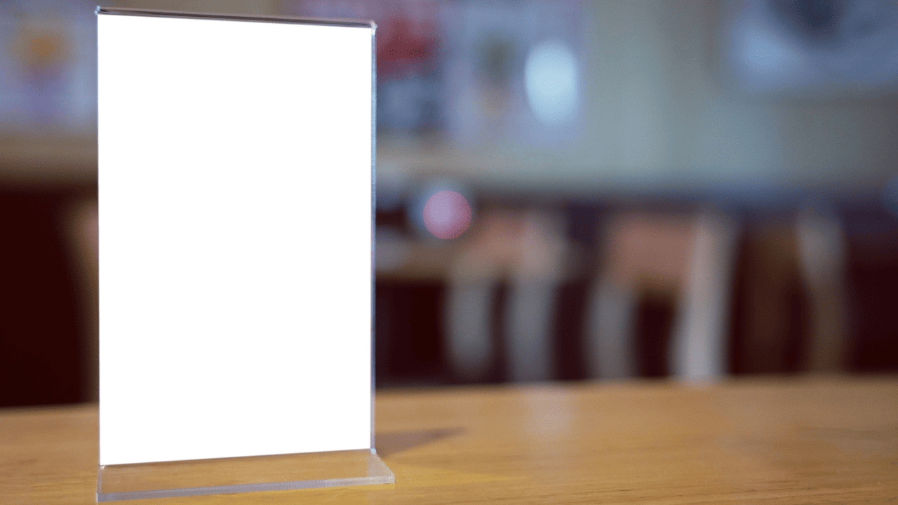
Presentation is just as important as content. Displaying your brochures properly ensures they are seen and picked up by potential customers. Brochure holders keep your materials organized and accessible, making them an essential addition to any business setting.
Consider using sign holders to highlight promotional offers or business card displays alongside brochures for a complete marketing package. These simple additions can significantly enhance your brand’s visibility and professionalism.
Take Your Marketing to the Next Level with Displays & Holders!
A well-designed brochure is just the beginning. Without the right display solutions, your marketing efforts may go unnoticed. At Displays & Holders, we offer high-quality brochure holders and display solutions that ensure your materials are seen and appreciated.Don’t let your brochures go unnoticed—enhance your marketing strategy today! Call 714-527-1179 or visit our website to explore our wide range of display solutions that make your brochures stand out.

